
A Look at the History of Web Design - Setting the Table
18th Jan 2013 by

Ever since the first web server came online in 1991, clever people have been inventing techniques and software, and pushing limits to make web pages and web sites more useful and engaging. Almost from the start, there has been a tension between designer’s vision and practical implementation that has driven web design down a number of paths during its short history.
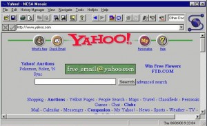
In the earliest days, the web was not considered a serious design medium. Early browsers were mostly text based with limited support for images. One of the first widely available browsers was Mosaic, which was easy to install, and was first to support the <IMG> tag for inline graphics.
Mosaic creators went on to form Netscape and with the release of the Netscape 2.0 browser, Netscape enhanced the capabilities of html with custom tags. Some were good innovations and others, not so and during this time, some of the worst looking web pages were published. Web pages were largely being built by non-designers. This was the era of animated gifs, noisy background textures, and blinking text. But designers were starting to take notice of the new medium.
Designers were initially frustrated with the capabilities available at the time, compared to mature mediums like printing. Print designers were able to precisely control color and layout. They could include high quality photography and choose from thousands of typefaces with carefully applied letter spacing. Because the design was printed on paper, they knew that everyone would see the same result. But in Netscape, you had limited colors, only a few typefaces, low res photography, and an uncertain page size. Designers developed some techniques to force some level of control onto the web page appearance. They discovered that they could use the table structure as a design grid to control position of items on the page. If they used images for headlines, they could continue to use their entire font library by creating images of the text. These practices became widely used on websites through the late 90’s because they did what designers wanted, but web sites built this way were difficult to maintain.
Also during this time, designers were experimenting with real world metaphors to organize home pages. A single large graphic representing an office might have a clickable file cabinet, or a clickable bookshelf to represent different sections of the web site. Or you might click on a door to go to another “room” on the site. Eventually, these ideas fell into disfavor as not being intuitive to the end user.
Despite having techniques to control layout, fonts and positioning, designers still had to cope with variations in how web pages appeared to the audience. This was a time of 640 x 480 16-color displays, the web-safe color palette, and dial-up connection speeds. Web pages looked very different compared to the high-end, large screen full color workstations that designers worked on. A good rule of thumb was to keep the web page plus all graphics under 50k for a reasonable load time. Plus, not everyone was using Netscape. AOL had their own web browser that did not work the same, and Microsoft had just come out with their own browser as well.
Almost all web sites built at this time used table-based design. Web sites that did not use this technique looked simplistic or amateurish by comparison. Table-based design mostly worked and it gave web designers an illusion of “pixel-perfect” design control. But table-based design had problems and better solutions were needed. Layout by tables was exceedingly complicated, with tables inside tables and images sliced into tiny chucks held together by the table’s structure.
By the time better, reliable solutions were available, table-based design was so widespread that remnants of it still survive on many websites today. At the rate we continue to push the limits of technology, one has to wonder if any piece of what we’re seeing out there today will be around twenty years from now.