
Responsive & Elastic Websites: Designing Your Website So It Works Everywhere – Mobile, Tablet and Desktop
25th Jan 2013 by

On Wednesday, January 16, 2013 I gave the following presentation on Responsive and Elastic Websites to one of our partners and thought I'd share it with you. While I'm sure some of the content, and certainly my humor, will be lost - I hope you find it useful. P.S. While I think I'm funny, my wife, kids and those who know me would probably disagree. ;-)
Overview
Do you want your website to look and work great on every device without having to create customized apps for smart phones and tablets? If so, creating a website that’s responsive and elastic may be your answer. Responsive and elastic websites conform to the visitor’s display automatically using some clever design techniques. No longer do you need to create different versions of your website for different displays or apps for mobile devices; you can now develop it once and have it look and work great everywhere.
Presentation
Yep, that's me (above). Last year I had a professional photo shoot which for some reason has compelled me to use these photos everywhere, to the detriment of everyone around me. I also found myself bored with the traditional PowerPoint themes so I decided to go a completely different route with this presentation. One employee, a designer of course, said it looked like I puked up colors and fonts on the presentation.
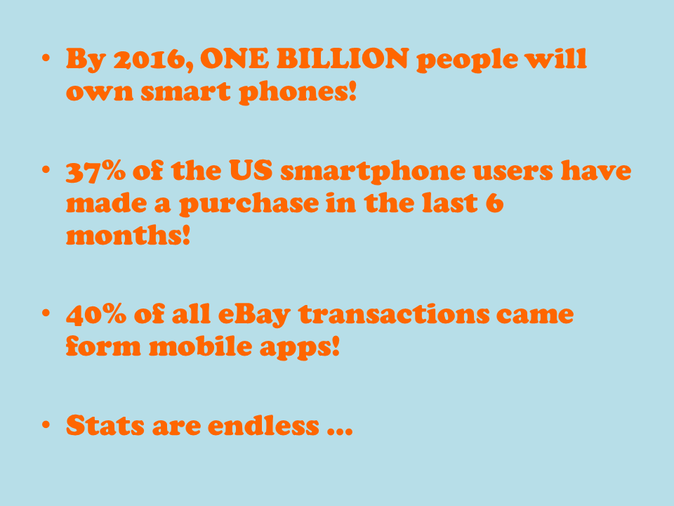
There are a lot of statistics and information out there regarding the importance of mobile commerce. For example, Forrester says mobile commerce will quadruple to 31 billion in the next 5 years. Boy that sounds like a lot and Forrester does a lot of research so they must be right. Right?

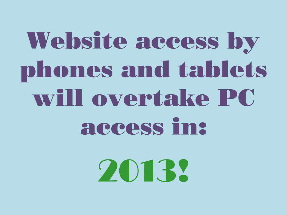
Holy cow! Website access by phones and tablets will overtake PC access this year! This statistic almost sounds impossible.
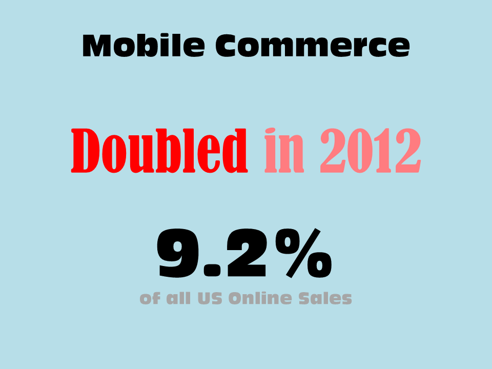
Mobile commerce doubled in 2012? I found that hard to believe as well until I figured out they lumped online sales using tablets into this number as well.
If you do a little spelunking you'll find more information about mobile commerce than you probably care to know.
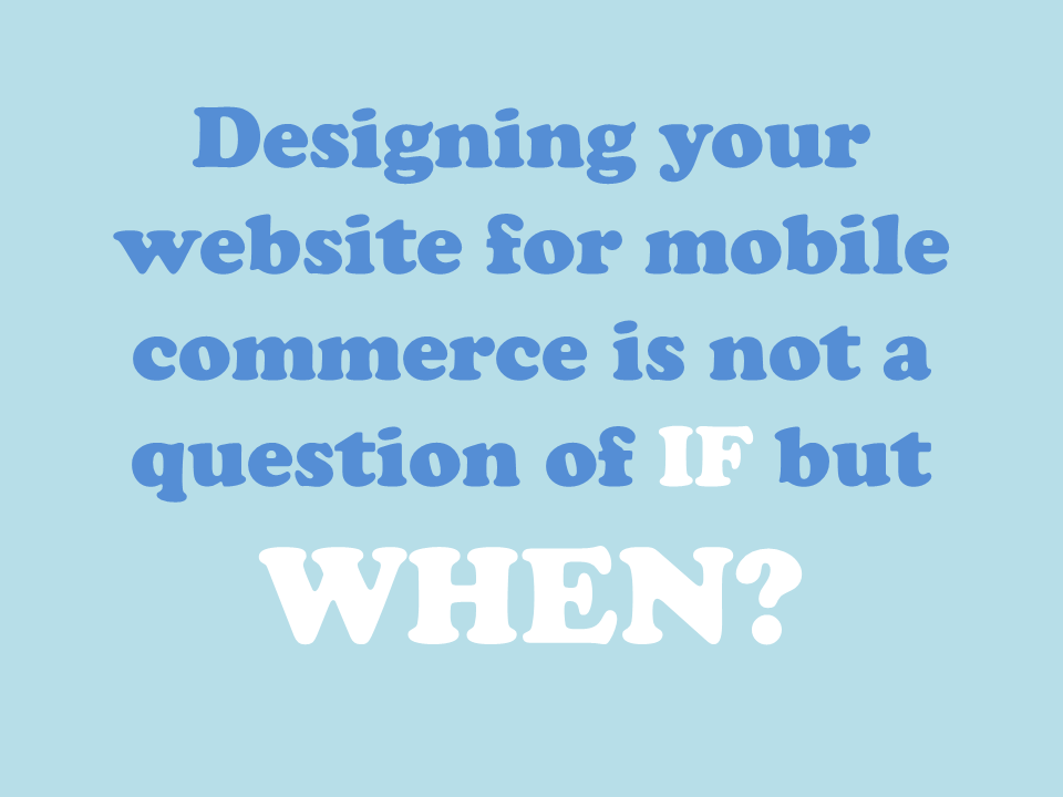
This is the kind of stuff that keeps me up at night. How important is mobile commerce really? Should we convince all our clients to implement responsive and elastic designs? I suspect some of our specialty retailers may not be able afford it. Will they be missing out on potential revenue? How can we justify the upgrade and additional costs? These are troubling questions for me because I try hard to spend our client's money like it's mine. Then it came to me. This isn't a question of IF but WHEN.
I think it's pretty clear that mobile commerce is important and will continue to grow. I believe everyone agrees. For me knowing WHEN is the important question. Luckily, you already have the answer; you just need to know where to look.

Google Analytics has the answer for you. Simply look at the number of visitors accessing your website using a mobile device. These are easy to spot in Google. In fact, Google has an area dedicated to mobile devices. Another tell-tale sign is to look at the screen resolutions of people visiting your website.

In this example 19.69% of the people visiting the site are coming in from mobile devices. This number does not even include all the mobile devices and the total traffic is well over 20%. I believe it is safe to say this customer is ready for mobile commerce.

Looking at another client's Google stats I notice a much different story. Mobile visitors to this site were not nearly as prevalent; they had less than 5% of the visitors coming to the site with their smartphones. Let’s reevaluate this client’s mobile traffic in 6 months. Maybe it’s a project for early 2014.
Both of these clients are using the same storefront platform so you might be asking yourself why such a difference? As you might have guessed it all has to do with the demographics of the customers visiting their website. The first example is a website that has young, hip clothing and therefore, a younger visitor. The second example appeals to an older, more established shopper.

Over the last couple of years I can't begin to count the number of times customers have asked us to create a mobile app for their website. I advised our clients against developing iOS and Android apps because I just couldn't see my customers keeping up with the development to make these mobile versions successful. Don't get me wrong; we have some large clients doing millions online per year, but the numbers still did not seem to add up. There was also the question of how do you get you customers to download and install your app. Do you need to spend your precious marketing dollars to promote the app instead of your website?
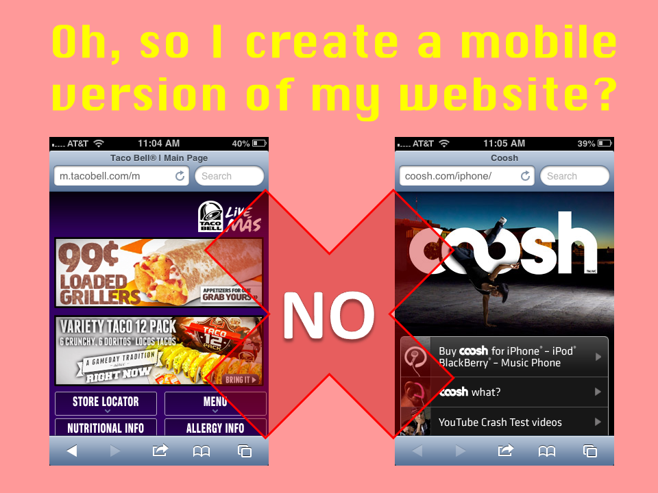
Does this mean I have to create a different version of my website for mobile devices? While this was in vogue a decade ago, you should not create a completely separate version of your website. Not only is it probably unmanageable for specialty retailers, it is also costly and not ideal for your Search Engine Optimization (SEO) initiatives.
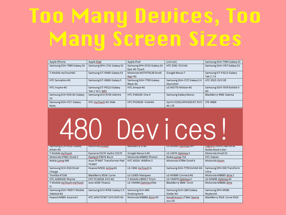
Additionally, have you ever looked at the variety of devices and screen resolutions coming to your website? The number is quite staggering. In the first example above I looked at the number of devices that accessed the website and I found 480 different devices that were used to access the website. It's a losing battle to try to build mobile-centric versions of your website for specific devices, there are simply too many!
Reponsive Design
Luckily there is a better solution to this problem and that's Responsive Design. At the risk of dating myself and labeling me as a geek, I have to say I felt like Luke Skywalker the first time I saw a responsive designed website. I was amazed at the power and flexibility it provided, and like Luke, I felt like we could finally slash this problem into pieces. Yeah, I know a horrible joke.

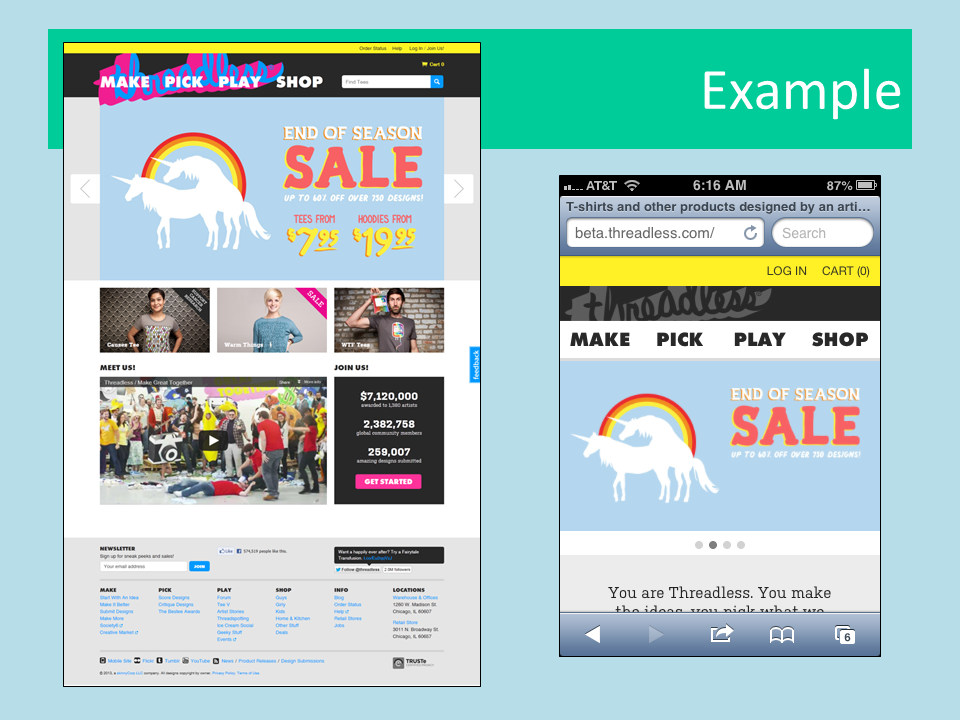
A great example of a responsive designed website is threadless.com. If you look at the website on your PC you'll notice a very different experience from your phone.
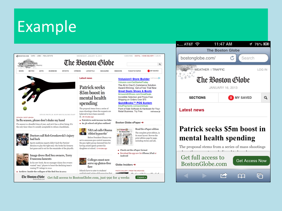
Another example is The Boston Globe. They were one of the early pioneers and have a very nice implementation. This site is nice because you can see it respond to you as you resize your browser on your PC. Take and drag the browser window and you'll see the page automatically render to fill the visible area of your browser. Threadless does not function like this, not because it isn't responsive, but because the developer knows you're viewing the site from your PC and therefore wants you to see a specific version of the site. But again, if you open threadless.com on your smartphone you'll see something completely different.
At this point in the presentation I showed several other websites using a live demonstration. The 7 Diamonds website is not completely responsive; really only the shopping page is responsive. However, this page does a great job of showing you the potential of a responsively-designed website.

Another example is the Sarah Pacini website. Like 7 Diamonds the site is not entirely responsive, but what they have done with the website is brilliant. Navigate to the shopping section until you can find their products displayed on the page. Now resize your browser window in all sorts of shapes and sizes. You should find the products on the page automatically resize, reorder and reshuffle on the page to fit your display. While I do not like their horizontal navigation, I have to marvel at what they did technically with this website.

Whereas the nuts.com is completely responsive - resize your browser window and take a look at the website on your mobile devices and you’ll see what I mean!

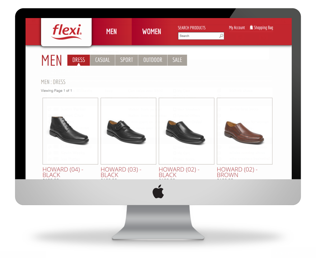
Finally, I showed off some of our own work, including Flexi.
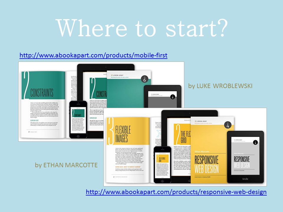
To understand more about responsive websites you really need to read two books - heck I even call them papers - by Luke Wroblewski and Ethan Marcotte. Luke’s book, Mobile First, describes how your team should focus on the mobile screen first and then move up to the big screen. Ethan is truly the godfather who coined the term Responsive Web Design and literally wrote the book on it. Without question, you need to buy these two books and for $9 each, they are an absolute steal.
That pretty much concluded my presentation on what a responsive designed website can do for your business. It’s important to remember to look at who’s coming to your website and what devices they are using so you can make an informed decision when to implement a responsive website design.
Learn more about what we're doing in Responsive Design for WordPress and Magento.