
The Photographic Principal - Rule of Thirds
8th Feb 2013 by
As a photographer, I’m a follower of the Rule of Thirds principle when shooting images of any kind. This rule absolutely applies to your website - especially if you shoot your own home page and look-book photos - as they will give you well-composed images rather than ones that are cluttered and disorganized. So what exactly is the rule of thirds and why should you use it?
The rule of thirds isn’t a new concept. The history of this rule began a couple of hundred years ago and was first written down in 1797 by John Thomas Smith in his book Remarks on Rural Scenery. In his book, Mr. Smith stated:
“Two distinct, equal lights, should never appear in the same picture: One should be principal, and the rest sub-ordinate, both in dimension and degree: Unequal parts and gradations lead the attention easily from part to part, while parts of equal appearance hold it awkwardly suspended, as if unable to determine which of those parts is to be considered as the subordinate. And to give the utmost force and solidity to your work, some part of the picture should be as light and some as dark as possible: These two extremes are then to be harmonized and reconciled to each other. “
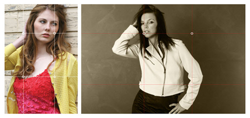
To apply this principal to your work, the focal point of the image should fall within one of the four-hotspot points within the frame of the image. This creates an intersection of imaginary lines. When doing this, the image automatically breaks into thirds. The imaginary lines can either be vertical or horizontal. It’s that simple! Above are a couple of examples.
Mr. Smith knew what he was seeing and it's more than likely that you have seen paintings or photographs where this rule was used, but never knew it. All you knew was that it was pleasing to the eye and enjoyable to look at. So, if you want to create images that are eye-catching and more importantly, images that sell, try using the rule of thirds and see what happens.
Note: This rule doesn’t necessarily apply to product page images.